
RBA makes IT easy
- Branding
- Design

petrokov logo rebrand
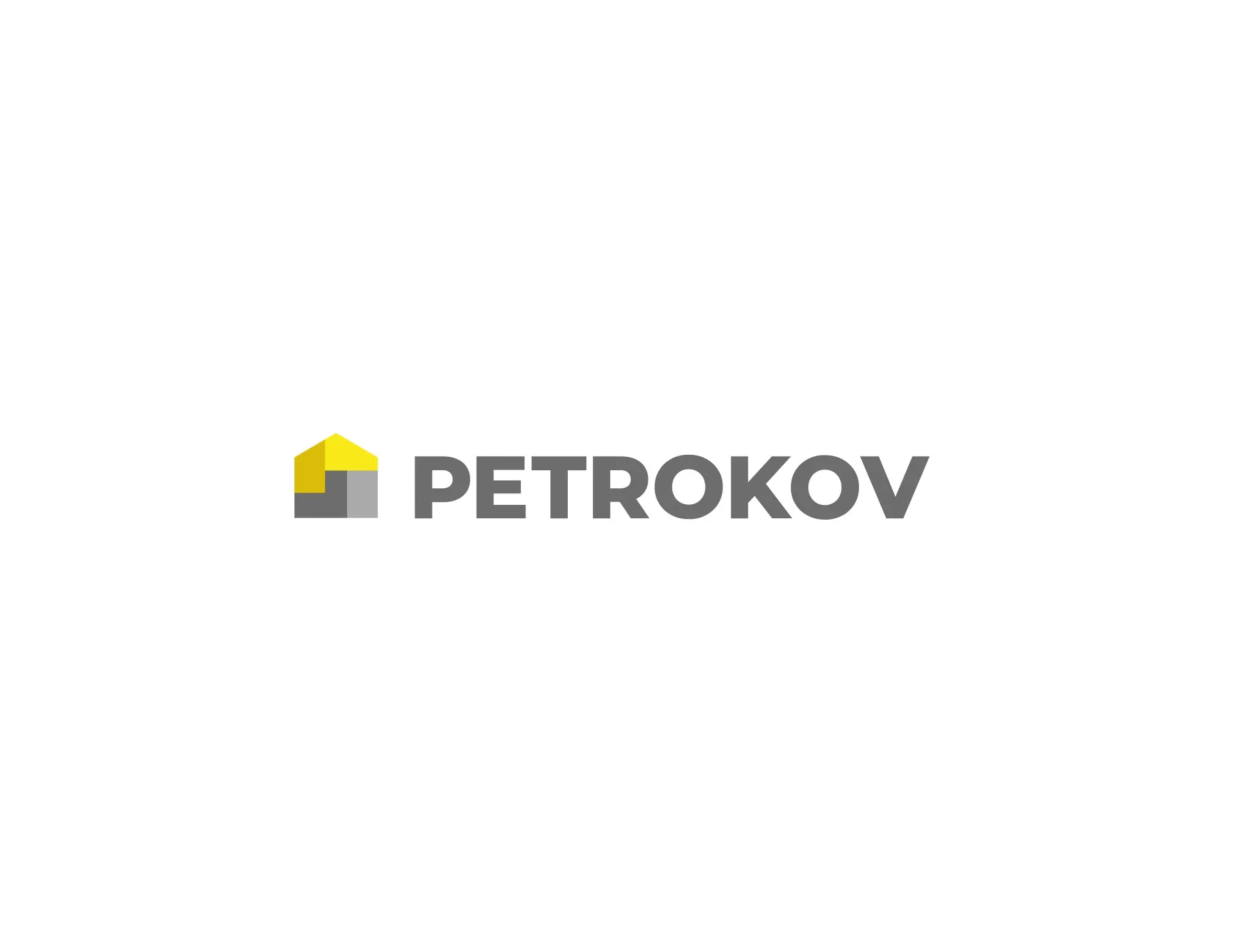
petrokov design
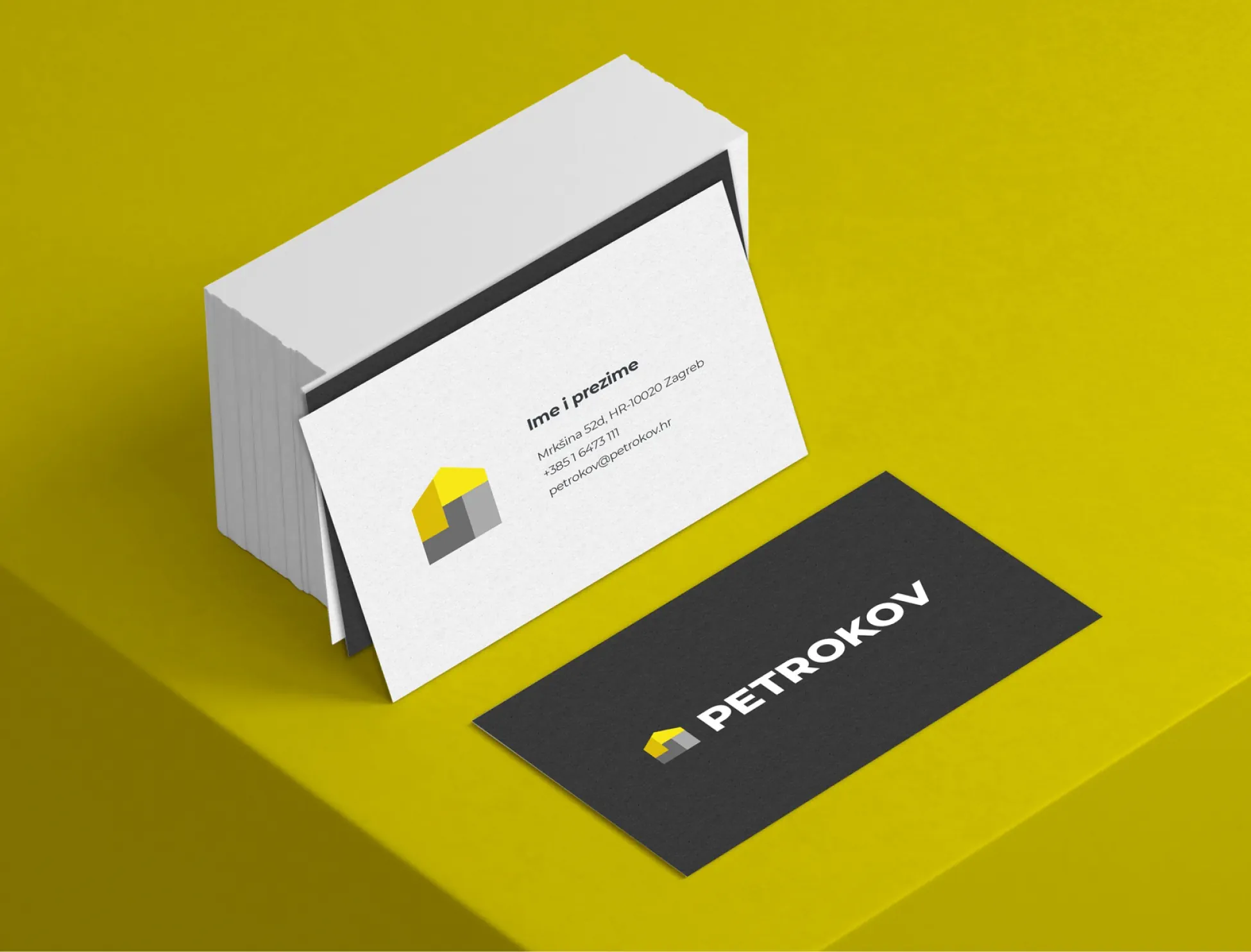
petrokov vizitke
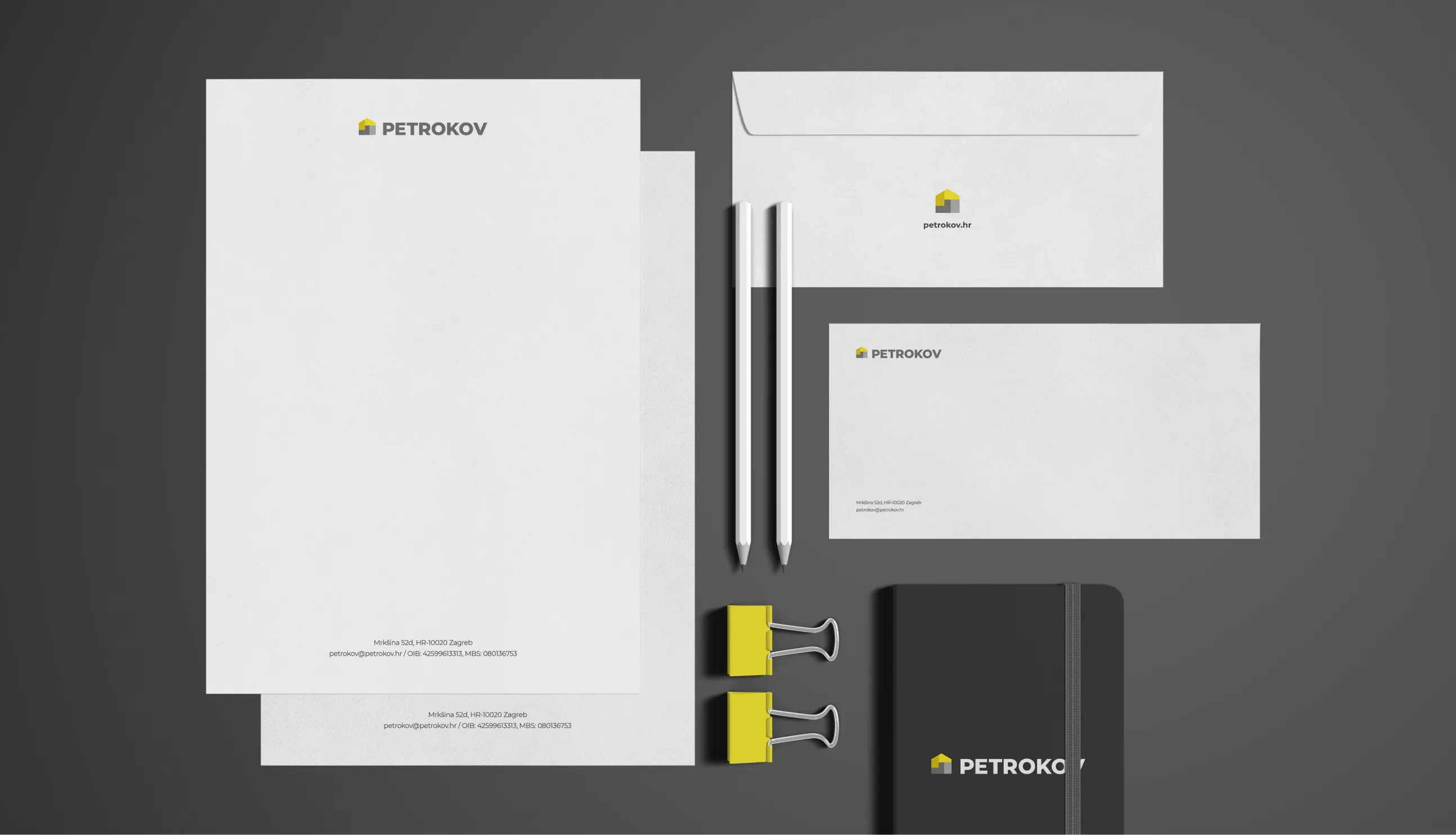
petrokov dizajn uredskih potrebstina
petrokov zastava dizajn
To reflect Petrokov's long-standing tradition, we preserved recognisable elements of its existing logo while updating and modernising its visual communication.
Visual communication reflects a brand’s values and development. Petrokov, one of Croatia’s most successful suppliers of heating, cooling and bathroom equipment, marked 30 years in business with a rebrand.
To reflect Petrokov’s long-standing tradition, we preserved recognisable elements of its existing logo while updating and modernising its visual communication. We retained the distinctive yellow colour and added a symbol alongside the name, giving the brand a memorable new visual element.
The new logo combines a symbol and name in yellow and dark grey. The typography is modern and streamlined, while the retained yellow colour represents the continuity of Petrokov’s 30 years in business.
The symbol added alongside the brand name sends customers a direct message by evoking a home. Its mosaic shape represents Petrokov’s varied range, from bathroom fixtures to heating and cooling equipment.

Rating: 4.7
